AD & Graphic Design
Graphic Design & UI / UX
P / 03 →
PHONE
+34 699 935 716
[ BRAND DESIGN ]
CLIENT
Empuriabrava
ABOUT
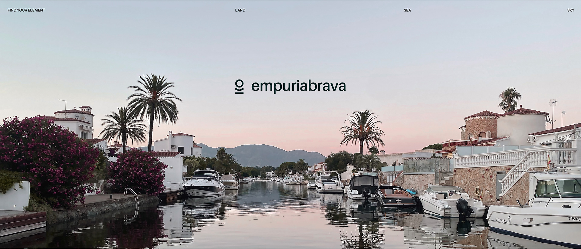
Empuriabrava is known for its navigable canals, its coastal charm where the wind plays a significant role, and its proximity to mountains and borders. The primary objective in developing this visual identity was to enhance the town’s perception, as Empuriabrava had significant potential that wasn’t being fully realized from a branding perspective. The challenge was to craft an identity that truly captures the town’s multifaceted charm, blending playfulness with elegance. In Empuriabrava, where land, sea, and sky intersect, I aimed to create a branding system that reflects this dynamic interplay and serves as a versatile framework. The result is a visual identity that makes the town an inviting destination for exploration and adventure.
YEAR
2022 – 2023
Concept Creation
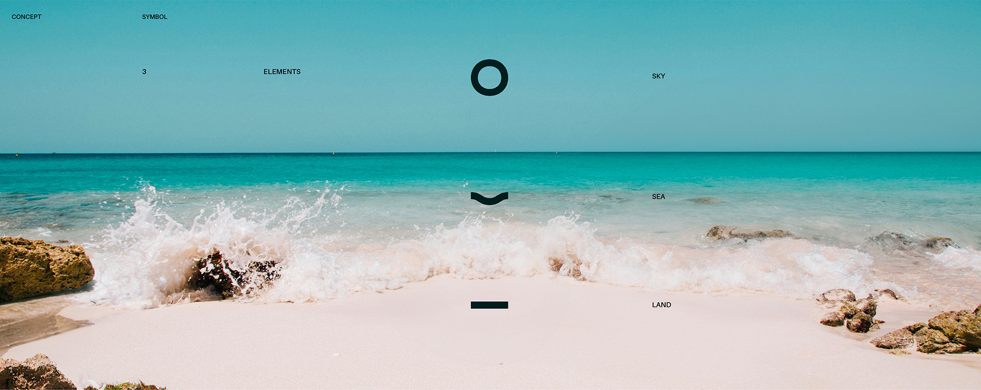
In designing the Empuriabrava logo, I centered the concept around the town’s defining elements: land, sea, and air. I envisioned these elements coming together in a horizon-like symbol to capture Empuriabrava’s unique essence. This approach allows each visitor to connect with these natural forces and choose their own adventure within the town’s diverse experiences.
Logo creation
Once the symbol was designed, I focused on ensuring a fluid interaction between the symbol and the typography. I chose a modern, accessible typeface for the word «Empuriabrava» that complements the clean, rounded shapes of the symbol. This approach was essential for achieving visual balance and cohesion in the brand identity.


Visual System
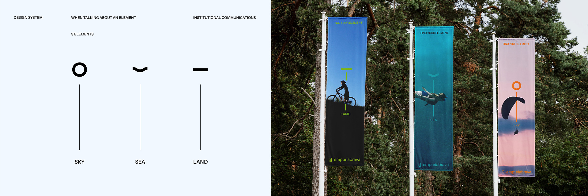
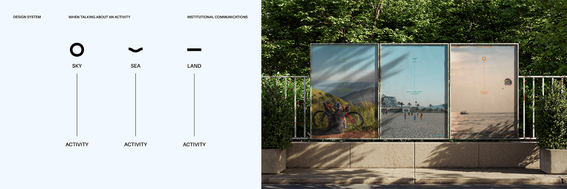
In designing the visual system, I aimed to integrate the logo’s symbolism with a thoughtful use of colors and images. Each color was chosen to enhance the visual narrative and reinforce the connection between the elements and the activities offered. This approach not only created a cohesive and elegant layout but also facilitated quick recognition and understanding of the elements and activities, enhancing the overall effectiveness of the visual system.
Additionally, the design was crafted to transition smoothly from a broad perspective—capturing the essence of the three elements—to more specific details as one delves deeper into the exploration of the town.
Layout Design
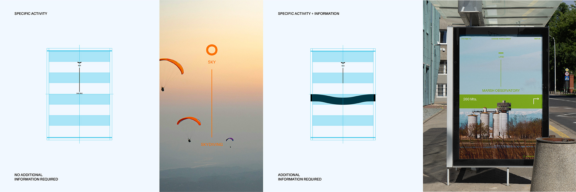
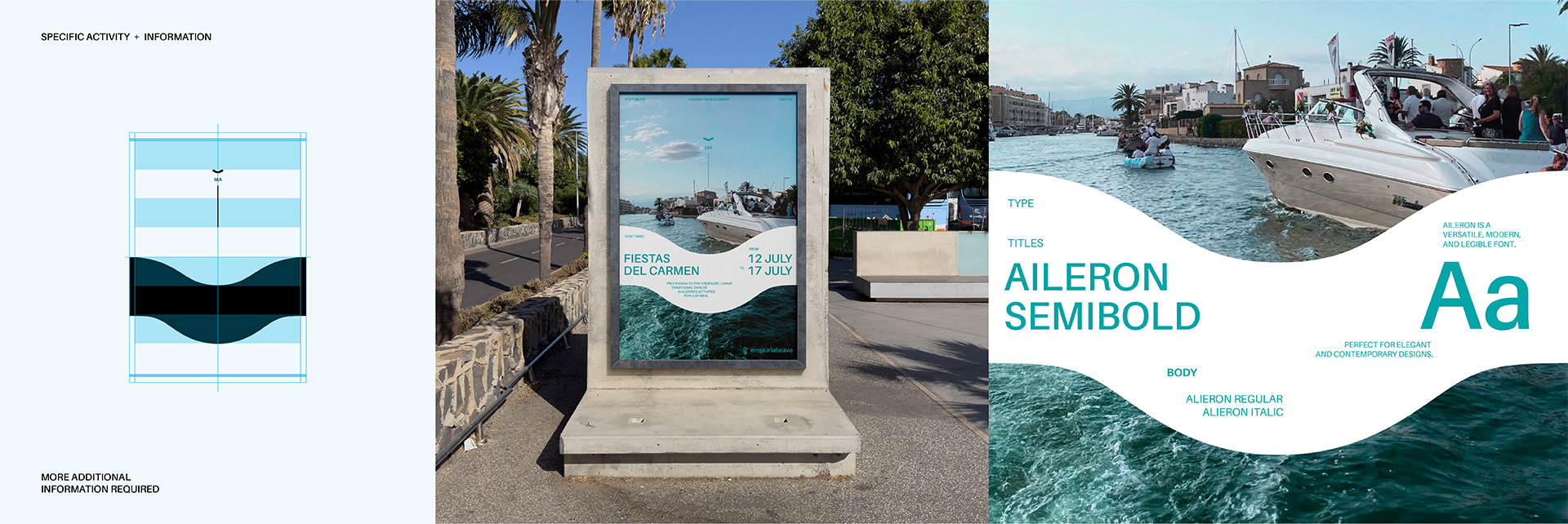
In developing the layout design, I created three distinct structures within the visual system, each tailored to handle varying amounts of information. This flexibility allows for adjustments in visual composition based on content density and importance, ensuring that the information is presented clearly and effectively.
Design Application
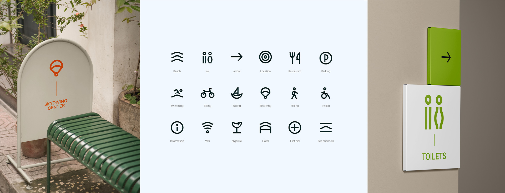
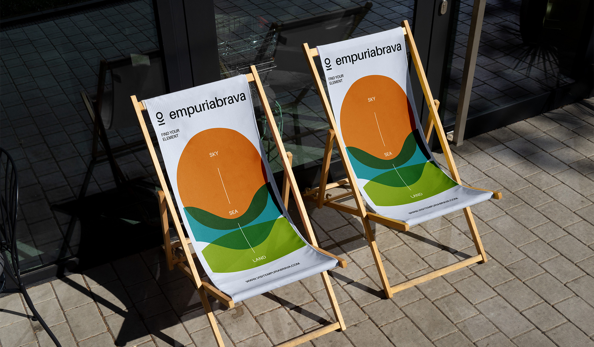
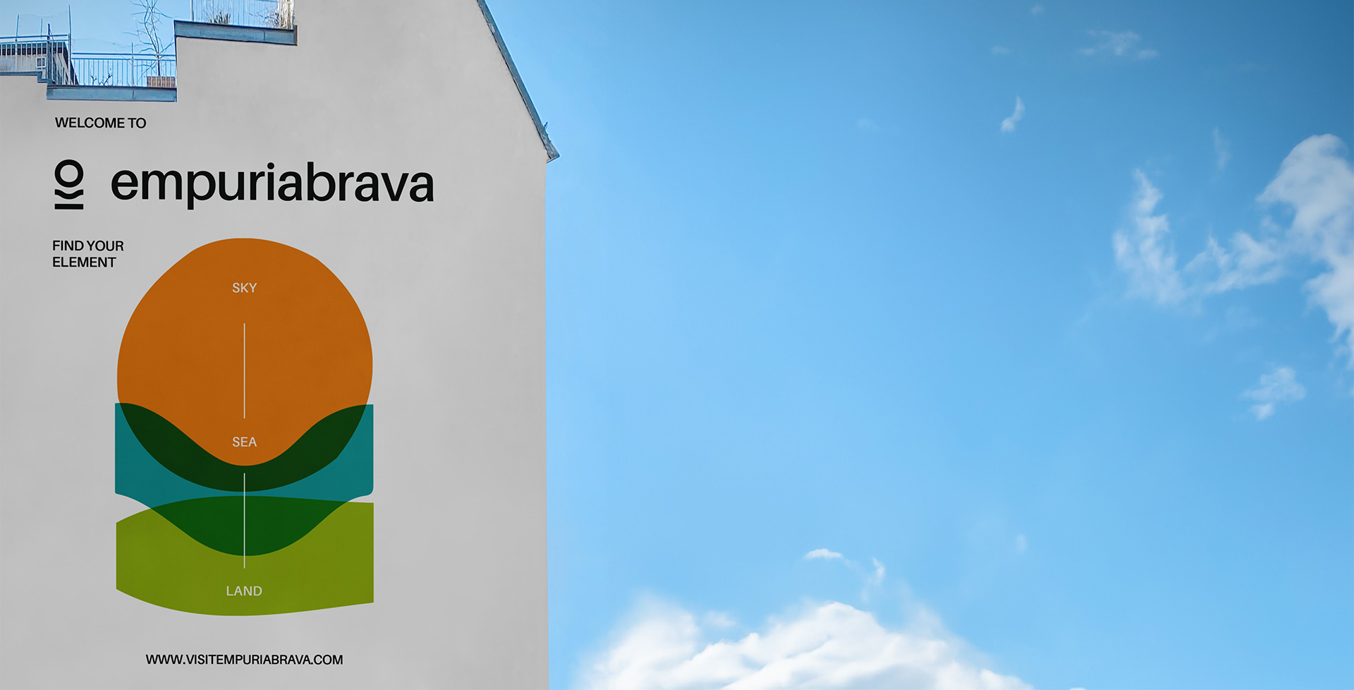
Since the creation of the system, I have applied the design consistently across various touchpoints, from websites to signage. The key was to ensure that the identity remains coherent with the original concept and visual play, effectively showcasing the town’s uniqueness and its wide range of activities in every interaction with the public.
Expanding the Visual Resources
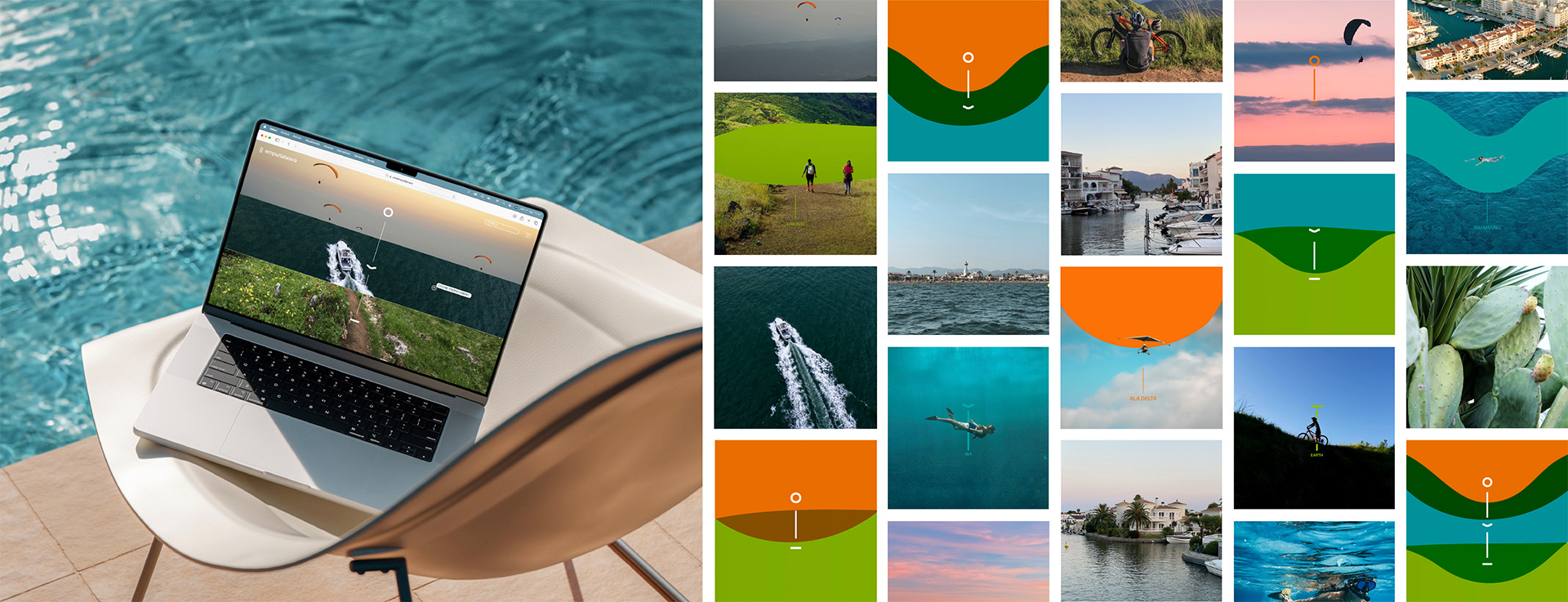
To enhance the visual impact for more commercial communications, we expanded the visual resources to create a more vibrant and eye-catching design, suitable for both digital and physical channels. By utilizing the established symbolic figures and corporate colors, we developed a dynamic interplay of color blocks and compositions. This approach allows for greater flexibility in presenting information and crafting engaging commercial materials while staying true to the brand’s core identity.

Crafting Empuriabrava’s Visual Identity
The Empuriabrava project aimed to elevate the perception of this vibrant town on the Costa Brava, recognizing its potential as a unique destination. The goal was to create a visual identity that would effectively communicate Empuriabrava’s diverse offerings and enhance its brand presence.
My approach began with in-depth, firsthand research, immersing myself in the city’s atmosphere and understanding the wide range of experiences it offers. This immersive process allowed me to capture the essence of Empuriabrava and translate it into a compelling visual identity.
In designing the logo, I focused on more than just the town’s prominent features, such as its navigable canals. I aimed to reflect the full spectrum of activities, including essential experiences like skydiving. This approach ensured that the identity was not only visually appealing but also representative of the town’s active and adventurous spirit. The symbol was developed to encapsulate the convergence of land, sea, and air, creating a versatile and engaging visual representation.
The design process involved several iterations to balance the logo’s symbolism with a modern, accessible typeface, achieving visual harmony. This flexibility was crucial for adapting the design across various formats, from digital platforms to physical signage, while maintaining consistency with the core concept.
Overall, this project not only enhanced the town’s visual presence but also ensured that every interaction with the brand conveyed its dynamic and multifaceted nature, solidifying Empuriabrava as a compelling destination for adventure and exploration.
Credits
Master Project
[ IDEP Barcelona ]
My Role
Individual project as a Graphic Designer
AD & Graphic Design
Graphic Design & UI / UX
P / 03 →
PHONE
+34 699 935 716